Judebert.com may be powered by the Serendipity blog engine, but it's really more like a website than a blog. There's a lot of information, some of which is not dynamic, like Contraction Timer or the EV conversion diary.
To make the information more available, I decided to redesign. I visited Free CSS Templates to find a template with big, immediately visible tabs, clear text, and a well-defined separation for links and sidebar items.
After some searching among many excellent alternatives, I picked criterion for my website. Although it was presented as a corporate template, it looked like it would fit my layout without too much modification. An easy fit was important because this would be my first template port.
The Bulletproof template made porting a breeze. Here's how I did it.
Porting CSS Templates to Serendipity
It really wasn't difficult, and it didn't take long -- despite the length of this tutorial. I learned almost everything I know about CSS from this CSS tutorial and goofing around elsewhere on the net (Google is almost as useful as a library). So you don't need to be a programmer to make Serendipity templates, it's not so complex it requires a college degree, and it's really quite rewarding. You should give it a try!
Template or Colorset?
Instead of creating an entire template on my own, I decided to make a Bulletproof colorset. Although the name implies only changing colors, a BP colorset can do anything CSS can do. Switching columns, replacing text with images, you name it. Since BP has been extensively tested on multiple browsers and operating systems, I saved myself a load of compatibility headaches, too. It turned out to be exceedingly easy: I was done in under four hours, including image reformatting and nitpicking cleanup.
Getting Samples
I downloaded and unarchived criterion to get its CSS and images. That also gave me a reference for criterion's structure.
Next I wanted a sample of Serendipity's HTML to apply the CSS to. It's possible there's a standard, typical blog load that designers use; I couldn't find it. I wanted something reasonably representative, but I didn't want to mess up my live website.
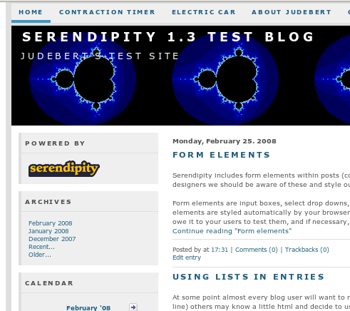
Luckily, Serendipity is dirt simple to install. I created a test blog in a subdirectory and imported the entries from themes.s9y.org. I used the Bulletproof blue colorset with a custom header and a tab bar. (This didn't allow me to look at extended entries, comments, or archive pages; next time I'll probably switch themes.s9y.org to the Bulletproof template and save a few pages from that instead.)
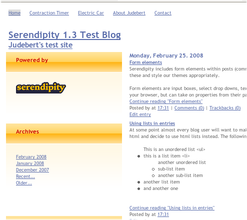
Then I saved the web page to a local directory as judebert.html. FireFox saved the images and CSS locally, too. That way I knew I wouldn't be hitting my website and using up bandwidth every time I wanted to test a change. Unfortunately, it didn't retrieve all the images referenced in the CSS. That wasn't so bad, as the screenshot shows; the only CSS image was the custom header.

Replacing the Styling
Next I opened the source and started looking for the CSS. Bulletproof included a lot of different stylesheets, but the one I wanted to replace was:
<link rel="stylesheet" type="text/css" href="judebert_files/blue_style.css">
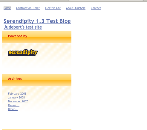
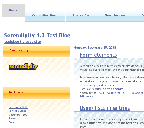
I removed the link entirely, just to see what Bulletproof looked like without any colorset. As you can see, it's pretty basic. What you can't see is that it's as cross-platform compatible as possible. All I have to do is shift it around and style it.
I copied the criterion stylesheet, which was called default.css, into the judebert_files/ directory as criterion_style.css. Bulletproof requires colorset stylesheets to be named colorset_style.css. That's how it detects extra colorsets and figures out their names. Then I replaced the blue_style with my new stylesheet:
<link rel="stylesheet" type="text/css" href="judebert_files/criterion_style.css">

That looked like a step backward. But it had styled the text to a new font and size. I figured it was just styling generic elements, and so messed up my Serendipity-specific stuff. I started walking through the criterion stylesheet, replacing stuff as I went.
Sidebar Boxes
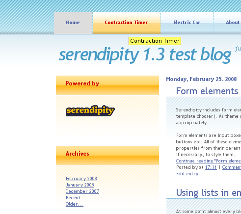
I removed any empty styles, figuring they were superfluous. Nothing was ever affected, so I guess I was right. The first interesting style I came to was .boxed. Checking the criterion index.html, I found that this was the equivalent of a Serendipity sidebar. I could tell because it contained the "Client Account" and "Recent Entries" boxes, floated left, just like a sidebar.
I checked my website HTML and found that Serendipity sidebars have the class serendipitySideBarItem. A little more digging to find the corresponding classes, and I replaced .title with .serendipitySideBarTitle and .content with .serendipitySideBarContent.
The criterion CSS used generic names, like "img06.gif", for their images. I wanted descriptive names: after all, if I installed more than one colorset, I didn't want them overwriting each other's images. I like PNG format, too. So I used the Gimp to reformat all the images and rename them whenever necessary.
So images/img05.gif was reformatted from the criterion directory as judebert_files/img/criterion_sbtitle.png, and img06.gif became criterion_sbcontent.png. A quick reload showed that I had styled sidebars!
Entries
But the entries were still way down low, below the sidebars. This is where Firebug, a fantastic web-development tool, saved my project. Without it, I certainly would have gone crazy and given up. With it, I just goofed around with a few things until I discovered that assigning a width to #content in criterion_style.css bumped the entries below the sidebar. I commented out that line, and it was fixed!
Next in the file was the .post class. This, it turned out, corresponded to the blog entries. The structure of the HTML was a little different, though. In criterion, the post was a wrapper around the title and text; in Bulletproof, there is no such wrapper. But the title is .serendipity_title, so I used that in place of .post .title. The text, originally in .post .story, was now .serendipity_entry. Of course, img07.gif was changed to criterion_entry.png.
The only odd thing there for the post class was that its paragraphs, blockquotes, and other tags were styled separately to have a bottom-margin and line-height. I decided this was a good thing for all those tags, regardless of their containers, so I promoted the style to p, blockquote, ul, ol.
And at the end of a reload, I was getting happy!

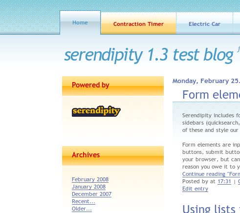
The Tab Bar!
Continuing down the stylesheet, I found #header. But I couldn't find any "header" in the criterion stylesheet at all. I can only assume that this designer is accustomed to making templates with extra features, and this style was a leftover. Commenting it out had no effect, and I moved on.
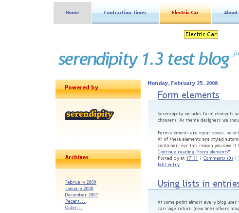
Next up, the moment I had been waiting for: #menu! I checked the criterion HTML to verify that these were, in fact, the tabs. In the BP source, the tabs are #sitenav. The structures were identical, too: unordered lists. Changing the class selector was all that was required there. Then I took care of the images, converting img02.gif to criterion_tab.png, img03.gif to criterion_tabhover.png, and img04.gif to criterion_tabactive.png.
Fixing Tab Bar Problems
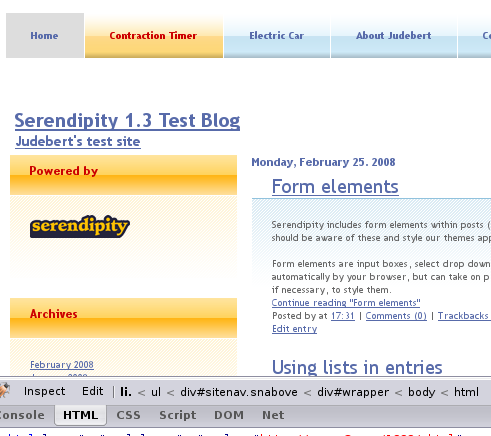
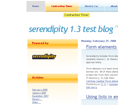
While I now had tabs, there was some sort of serious problem: the first tab was higher than all the others. Once again, Firebug came to the rescue. I toggled each attribute on the sitenav, the ul, and the li styles until the tabs lined up. The problem turned out to be that serendipity.css was applying a padding to #sitenav ul li. I have no idea why it didn't bump the first menu item down, but removing it lined everything up.
Since that style didn't appear in criterion_style.css, I created it, setting the padding to 0. I had tabs! With a hover effect, no less! (You can just see some of the Firebug menu in the screenshot.)
The Banner
Next up in the stylesheet was #logo. This corresponded almost exactly with #serendipity_banner. That was a quick search-and-replace, without even any images to worry about. Neat what you can do with CSS, isn't it?
The Page Width
Continuing along, I found #content. This is where I commented out the width, because it messed up BP's content div, which wrapped the entries. But criterion's content div wrapped entries and the sidebar, leaving the header and tab menu outside. Nothing in BP matched that.
Since I couldn't find a perfect match for structure, I tried to find a match in functionality. The content div pretty much set the width of the page for criterion; in BP, the closest thing is #wrapper. So I changed #content to #wrapper and restored the width: 740px; line I had commented out earlier.
As you can see, everything has moved over. I've never been a fan of fixed width templates, but I decided not to fix it yet. I wanted to finish the rest of the porting before I moved on to actual modifications.
The Entry Column Width
The next style from criterion was #main. This wrapped the entries, which corresponded to BP's content div. The only style was a width and a float. Since BP already takes care of the placement of sidebars and entries -- allowing lots of combinations not considered by the designers of criterion -- I didn't want to float the entries on my own. I removed the float from #content, but I kept the width, just to stay true to criterion's original design.
Then followed styles for the welcome entry and the example entry. They were empty, so I deleted them.
The Sidebar Width
The next useful style was for #sidebar. Anybody could tell that was for the sidebar. Again, I kept the size and removed the placement, so BP could place the sidebar wherever it wanted. But Serendipity provides for two sidebars, #serendipityLeftSideBar and #serendipityRightSideBar, so I had to include both in the style selector.
Then came a bunch of criterion-specific styles, like the login box, text entry fields, the updates box, and the partners box. I deleted these. That was plenty for one edit, so I saved and had a look at my progress.
The Footer
The next style was #footer, which matched BP in structure and name. The only thing I had to change was the image: img08.gif became criterion_pagefooter.png.
There were some more styles specific to criterion afterwards, so I deleted them. That led me to the end of the file, and a feeling of accomplishment.
Troubleshooting
Missing Graphics
But wait! There's something missing: the background from the top of the page! The original has a crosshatch, leading to a nice fade. Where's mine?
I figured this must be on the body, so I searched my stylesheet for the body tag. Sure enough, I had forgotten to port an image. I changed img01.gif to criterion_body.png and got my crosshatch.
Misaligned Tabs
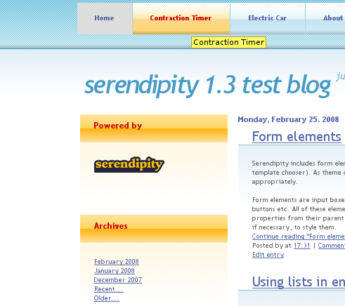
More problems?! (I thought this was supposed to be easy!) My tabs didn't line up with the body graphic. I mulled this over for a little while, and decided the problem must be in one of the other stylesheets: I was using the same CSS as the original, so the problem had to be elsewhere. Firebug again, but this time I only toggled properties that came from other stylesheets.
I found that base.css was applying display:inline; to the list, which was preventing any margins from taking effect. Toggling it in Firebug dropped the tabs too far, though. More toggling, and I found that serendipity.css applied more padding to the sitenav div.
I added padding:0 to the sitenav style, and display:block to #sitenav ul.
Unstyled Tab
So, what's up with the gray first tab? Firebug didn't want to load its style, so I was reduced to using my intelligence. (We're doomed!)
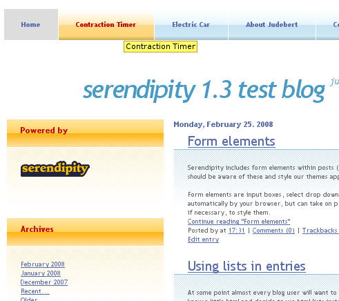
I examined the HTML from Bulletproof, and discovered the tabs are identical except for their class: the first tab's li is both currentpage and navlink_first, while the others have an empty class. When I removed the currentpage class, the first tab displayed like all the other tabs.
That told me something else, too: #sitenav .active a from criterion corresponds to #sitenav .currentpage a in the BP structure. Simply replacing the style selector with the BP specification fixed the problem.
Tiny Little Words
I also think the font is a bit small. Sure enough, BP sets the font size to 80% on #wrapper. I put that back to 100%.
Serendipity and Bulletproof Improvements
So my adaptation now looks like the original. That's good. But Bulletproof and Serendipity allow much more than the original example HTML. For starters, BP allows multiple sidebar configurations. And Serendipity includes comments and archives, which aren't considered in criterion. Rather than trying to create a bunch of local pages, I uploaded my files to my live website to try some of Bulletproof's options.
I simply copied the files into the templates/bulletproof and templates/bulletproof/img directories. When I went to manage themes, BP found criterion and let me choose it as my colorset. No modifying code!
Since I was modifying a live website, I didn't wait around to take screenshots for the problems or odd configurations. You'll just have to take my word for my results.
Sidebar Configurations
BP allows multiple sidebars in multiple configurations. Including top and bottom sidebars. My first problem was that the width of the sidebars was just too big for configurations with two sidebars, such as S-B-S. I fixed that by changing the generic Serendipity styles to BP configuration-specific styles.
For instance, the content column (#content) was too big in any three-column mode. In BP, the content is marked with .twomain in two-column mode and .threemain in three-column mode. So I changed my stylesheet from:
#content {

  width: 505px;

}
to:
/* Two columns, main and sidebar, just like criterion */

.twomain {

  width: 505px;

}

/* Three columns, main and two equal sidebars */

.threemain {

  width: 400px;

}
Likewise, the sidebars were just too big for three-column mode, so I reduced their size, too. In BP, the two-column sidebar class is .twoside, while the three-column is .threeside. (Hurray for concise class names!)
When I tried side and bottom sidebars, stuff broke. The BP-assigned width for the side sidebar was fine, but there were supposed to be five sidebars across the bottom, and I only got four. I found that the 740px provided by criterion was just insufficient to fit 18.5% sidebars with an 11px margin. I chose to reduce the sidebar width to 18%, which fixed the problem.
All in all, I changed the stylesheet from:
#serendipityLeftSideBar,

#serendipityRightSideBar {

  width: 220px;

}
to:
/* Two columns, main and sidebar, just like criterion */

.twoside {

  width: 220px;

}

/* Three columns, main and two equal sidebars */

.threeside {

  width: 160px;

}

/* Bottom sidebars, 5 items at a time */

.onefull .serendipitySideBarItem {

  width: 18%;

}
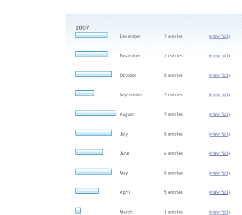
Archive Bars
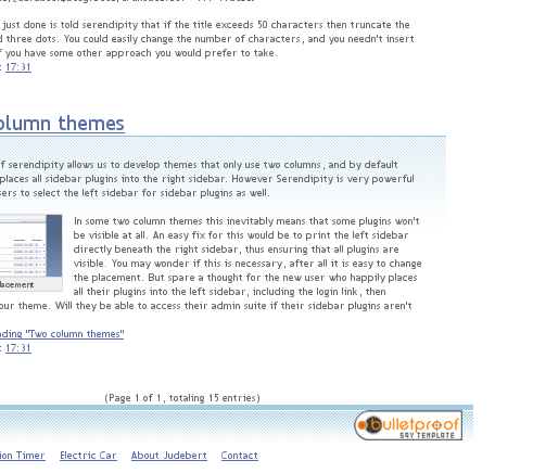
I also wanted to do something different for the archive page. It uses images as graph bars. The default is a nice dark blue with a black border; while criterion is also bluish, the dark blue default bars clashed with the criterion's cyan page.
I resized one of the tabs to a shorter height and saved it as criterion_graph_bar.png, which is also required by Bulletproof. Since the black border was applied as a style directly on the img tag, overriding it required !important in the stylesheet:
/* s9y-specific items */

/* Archive page

 * This uses a element-styled black border, and stretches the bar image.

 */

.archives_graph img {

border: 1px solid #479ac6 !important;

}
Comments
Of course, Serendipity also supports comments and trackbacks. Under BP, each goes in its own separate container, but the containers have multiple classes, including serendipity_comments. I decided to copy the entry divider, so I just copied its style with the correct class name:
/* Comment and trackback dividers */

.serendipity_comment {

  padding: 20px 20px 10px 20px;

  background: url(img/criterion_entry.png) repeat-x;

}
Don Chambers and I have been working together on Serendipity for a while. He noticed my comments were not styled. I took a hint from his website, and copied part of the comment format. Instead of his grays, I used colors taken from the tabs for normal comments, and colors from the sidebar titles for "self" comments (comments made by the article author):
/* Comments */

.comment_oddbox, .comment_evenbox {

  border: 1px solid #91c2dd;

  padding: 5px 5px 3px 5px;

  background: #e7f5fc;

}


.comment_oddbox .serendipity_commentBody,

.comment_evenbox .serendipity_commentBody {

  border: 1px solid #c8e3f3;

  padding: 1em;

  background: #f8fcfe;

}


.serendipity_comment_author_self

{

  border: 1px solid #fed98a;

  padding: 5px 5px 3px 5px;

  background: #fef3d3;

}


.serendipity_comment_author_self .serendipity_commentBody

{

  border: 1px solid #fed98a;

  padding: 1em;

  background: #fffaed;

}
Going Fluid
I don't like fixed width templates. I much prefer fluid styles. So I adapted the criterion_style.css to a fluid version, criterion_fluid.css. I copied all the BP required images from criterion_whatever.png to criterion_fluid_whatever.png:
- colorset_back.png -- The previous month arrow for the calendar
- colorset_forward.png -- The next month arrow for the calendar
- colorset_graph_bar.png -- The archive page graph bar
I left the stylesheet the same, so I was reusing all the other images. Then I removed every "width" property from all the elements. The only exception was the #wrapper: I wanted to have a little margin around the content. So I set it to 95% instead of 740px.
Since I was going to allow BP to control the size of the content and sidebars, I also removed the .twomain, .twoside, .threemain, .threeside, and .onefull .serendipitySideBarItem styles. These didn't have anything but width in them anyway.
Voila! Fluid webpage! You don't even need a screenshot: you're soaking in it!
Respecting the Copyright
As far as I was concerned, I was done. The only problem with this whole exercise was that I couldn't distribute it. The license for all templates from Free CSS Templates requires a link back to their website, and I respect copyrights. BP provides a way for the user to add text to the footer, so I could add the link on my own website and use the template. But I couldn't give it back to the s9y community, because there was no way to ensure the link would be added.
I discussed this with the best community in the world, the Serendipity Forums. They said if I made modifications to BP that allowed colorsets to include a license, they'd include the mods. So I did; about an hour later, colorset designers could get an attribution in the credit line, copied from their colorset_license.txt file. This is not a BP required file; if you leave it out, no attribution will appear.
I then made a criterion_license.txt and criterion_fluid_license.txt file. I packed everything up in a zip file and submitted it in the Serendipity forums, which is probably why you're here now.
Using Criterion Yourself
It probably won't be long before my criterion ports are available on s9y-bulletproof.com. Until then, you can download criterion here.
Just unzip the archive into a new directory (it doesn't come with one of its own). Use FTP or your provider's file manager to upload the files to Serendipity's templates/bulletproof/ and templates/bulletproof/img/ directory.
Now go to your admin screen and click "Manage Themes". Pick the Bulletproof template, if you haven't already. When the template options come up, just choose "criterion" or "criterion_fluid" from the colorset choices. I recommend using a navbar, positioned above the header. It'll probably work in other configurations, but it'll probably look a little weird.
Make sure to hit the save button! Enjoy your new template!
You like this little tutorial? Want more like it? Or maybe you just want to support my ongoing efforts to improve our world; either way, feel free to donate a little something.