I'm considering adding a star rating tool to my website. But I don't like using JavaScript if I can avoid it. Luckily, I found a tutorial on creating a star rating bar using pure CSS on the web.
Using the lessons learned in his tutorials (note the plural), I had a few insights and made a few improvements. For instance, the rating bar can vary in color or shape from one end to another. It can even be animated! Finally, I made the current rating parameter easier to generate for blogs and such.
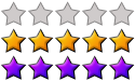
Here's an example of my rater, using the single image from the start of this article. It's in PNG format:
This is similar, but with a different (perhaps more pleasing) color scheme:
I modified those (on my own) to create this glowing scheme, which uses only a single star image instead of a full bar:
Here's a rainbow rating bar:
Here's a nice animated GIF example, taken from emoticons I found online:
My graphics skills leave much to be desired. Especially at the pixel level. (That's why I learned how to generate fractals and to ray-trace.) Thanks to Don for his much better star image and rainbow bar!
In case you missed the original tutorial (cheater!) here's a quick explanation of how it works.
The stars are implemented as a big UL. Each star is in its own LI. There's an A in there, too, because some browsers don't know how to implement :hover on anything else. The current rating goes in an LI, too.
We assign the rating bar image as the background for the UL itself, the current rating, and the hovered anchors. The LIs and the unhovered anchors we leave with no background at all.
Next we shove everything up into one rating bar of space. We accomplish this with "position: relative;" on the UL (making it a valid container) and "position: absolute;" on the anchors and the current-rating LI. By default, absolutely positioned elements are removed from the flow and placed at 0,0 in the first explicitly positioned container (in our case, the UL). Normally the UL would now take 0 pixels of space (because all its contents have been removed from the flow), so we explicitly assign it one rating bar of space.
Note that the background image is placed in the upper-left corner by default. Since we just made the UL big enough to display only one rating bar of the image, it displays the top bar. That's the one that looks empty.
Everybody else is stuck together, with no size, in the UL's top-left corner. So we assign each anchor a size equivalent to the number of stars it holds. The leftmost anchor gets 20%, the next gets 40%, the next 60%, and so on. The current-rating LI is handled specially: its size is determined by the rating.
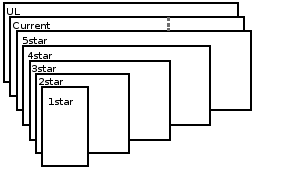
We want these things stacked on top of one another so they show through in the correct places. The UL, with its empty-bar image, should be on the bottom; this is the default, z-index: 0. The current-rating LI is next up, at z-index: 1. Then the anchors. Order is important: we want the browser to notice when we move the mouse, and if the rightmost anchor is always on top, it'll completely cover all the others. So we make the rightmost the lowest, at z-index: 2; it covers everything below it. Four-stars is next, at z-index: 3; it covers everything below it, except for the rightmost star. We keep it up until we get to the leftmost, one-star, which is z-index: 6. It only covers one star of the stack, but it's on top, on the left.
Finally, we've got to modify the images. If you've been following diligently along, you know that we've got all the bars stacked on top of one another, with their rightmost stars peeking out. But you may have noticed that they're all showing the empty-bar portion of the image. We'll fix this by aligning the background image to the top, bottom, or center.
For the current-rating bar, we specify "background-position: center;", which corresponds to the "rated" bar. Since it's only one bar tall, it displays only the rated portion of the image. Since it's width corresponds to the rating, it doesn't cover up the whole image. And since it's underneath everything but the UL itself, it only covers up the empty bar.
The hovered anchors we set to background-position: bottom;", which corresponds to the "my rating" bar. Normal anchors contain no background, so they're completely transparent until you hover on them. Again, they're only one bar high, so they only let the "my rating" portion of the image show through. And each one only covers its section of the bar, so when you hover, you don't cover the whole thing (unless you're voting for 5 stars).
In the original tutorial, the background image is repeated, so the stars must all be identical. However, if a full bar is used instead of an individual star, the image replacement still works as expected. That opens the possibilities of stars with different faces (or just emotions), not to mention animated rating bars. If we make the full-bar animated image with all three bars in sync, it should always stay in sync, since we're just displaying different parts of the same image anyway.
So I had discovered eye-candy (despite my terrible graphics). But the real problem was the current rating size.
The original method needed the server to know two pieces of information: the width of a single star in pixels, and the rating average. These were multiplied together to create a pixel width, which is added to the rating as an inline style. That's a hindrance for blogs and other dynamically generated raters, since they need to know the pixel width of a single star. That makes it difficult to substitute differently-sized graphics for your bar.
To make the rating bar truly flexible, it needs to be freed from the pixel. Luckily, it's not all that tough to make the browser do that little piece of math (at least in FireFox; I haven't tested IE).
I just modified the CSS so the font pixel size was one star width. Then I set the current rating in EMs. The browser does the multiplication for me. When I change the image, I only need to change the CSS.
In the example above, here's the HTML:
<ul class="rating">
<li class="current" style="width: 2.75em;">2.75 out of 5</li>
<li><a href="#1" class="rate1" title="I hated it">*</a></li>
<li><a href="#2" class="rate2" title="I disliked it">*</a></li>
<li><a href="#3" class="rate3" title="It was OK">*</a></li>
<li><a href="#4" class="rate4" title="I liked it">*</a></li>
<li><a href="#5" class="rate5" title="I loved it">*</a></li>
</ul>
To get the different bar image and size, I just added a single class ("ratingsmile", in this case) to the HTML and a tiny bit of CSS, just like the original tutorial did for his small-star class.
In fact, here's the CSS now:
/* Background is full bar */

.rating,

.rating a:hover,

.rating .current

{

  background: url(ratingstars.gif) left;

}

.rating

{

  position: relative;

  width: 125px; /* 5 stars width */

  height: 25px; /* 1 star height */

  overflow: hidden;

  list-style: none;

  margin: 0px;

  padding: 0px;

  background-position: top left;

}

.rating li

{

  display: inline;

}

.rating a,

.rating .current

{

  position: absolute;

  top: 0;

  left: 0;

  text-indent: -9000px;

  height: 25px; /* 1 star height */

  line-height: 25px; /* 1 star height */

  outline: none;

  overflow: hidden;

  border: none;

  /* I replaced the pixel-width with an em-width, but must set font size in px */

  font-size: 25px; /* 1 star width */

}

/* Show stars when hovered */

.rating a:hover

{

  background-position: left bottom;

}

/* Set each section to the appropriate width, stacking so leftmost is topmost */

.rating a.rate1

{

  width: 20%;

  z-index: 6;

}

.rating a.rate2

{

  width:40%;

  z-index: 5;

}

.rating a.rate3

{

  width:60%;

  z-index: 4;

}

.rating a.rate4

{

  width:80%;

  z-index: 3;

}

.rating a.rate5

{

  width:100%;

  z-index: 2;

}

.rating .current

{

  z-index: 1;

  background-position: left center;

}

/* Overrides for smiley bar */

.ratingsmile

{

  width: 100px;

  height: 20px;

}

.ratingsmile,

.ratingsmile a:hover,

.ratingsmile .current

{

  background-image: url(ratingsmiles.gif);

  /* Set these if different from original bar height */

  line-height: 20px;

  height: 20px;

  font-size: 20px;

}

/* Overrides for rainbow bar

   (since size is the same, only need to change the image) */

.ratingbow,

.ratingbow a:hover,

.ratingbow .current

{

  background-image: url(rainbow-bar-1.png);

}

/* Overrides for alternate color */

.ratingbar2,

.ratingbar2 a:hover,

.ratingbar2 .current

{

  background-image: url(jude-demo-star-1.gif);

}